For the summer 2026 remodeling season, the industry has officially moved away from the “Millennial Gray” and stark white era. The current trend is what designers are calling a “Collective Exhale” shifting toward grounded, nature-inspired palettes that feel timeless rather than trendy.
If you’re looking to update your spaces or advise your readers at DLifestyleMagazine.com, here are the dominant color stories making the rounds right now.
1. The New Foundations: Warm Neutrals
Cool grays are out; “Khaki” and “Oat” are in. The goal this summer is to create a cocooning effect rather than a sterile gallery feel.
- Universal Khaki: Named the 2026 Color of the Year by Sherwin-Williams, this mid-tone neutral is the backbone of current remodels. It’s being used for “color-drenching” (painting walls, trim, and ceilings the same color) to create sophisticated, seamless spaces.


- Warm White & Linen: Instead of bright “hospital” whites, homeowners are opting for creamy off-whites that pair better with natural stone and wood.

2. “Sunbaked” Earth Tones
Inspired by Mediterranean and high-desert landscapes, these colors bring a “Pinkies Down” warmth to kitchens and living areas.
- Terracotta & Clay: These are huge for 2026, particularly in bathrooms and dens. They offer a rich, organic energy that feels expensive but approachable.


- Warm Mahogany & Burnt Ochre: Deep, reddish-browns are being used as “Restorative Darks” for dining rooms and cabinetry to add a storied, artfully aged vibe.


3. The “Smoky” Greens & Blues
Loud, vibrant colors have been replaced by “muddy” or “smoky” versions that act as neutrals.
- Smoky Jade & Eucalyptus: This is the top choice for kitchen cabinetry right now. It sits between blue and green with a heavy gray cast, making it feel grounded rather than “preppy.”


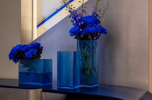
- Indigo & Muted Teal: Dulux’s 2026 focus is on “The Rhythm of Blues” dusty, indigo-influenced shades that mimic the ocean and clear summer skies without being overly bright.

4. Subtle Accents: “Frosted Tints”
For those wanting a pop of color without the commitment of a bold feature wall:
- Muted Lavender & Buttery Yellow: These “milky pastels” are appearing in powder rooms and as accent cabinetry (coffee bars or beverage stations). They add personality without the “maximalist rebellion” of previous years.

Remodeling Snapshot: Where to Put What?
| Space | Recommended Palette | The Vibe |
| Kitchen Cabinets | Smoky Jade or Espresso Brown | Refined, custom-built look. |
| Primary Suite | Dusty Blue or Soft Sage | “Spa-like” sanctuary; biophilic. |
| Living / Open Plan | Universal Khaki or Warm Sand | Flow and cohesion; invites natural light. |
| Powder Room | Deep Plum or Terracotta | Moody, intimate, and intentional. |