The Colours of Christmas 2026: Six Paint Shades Giving American and European Homes a New IdentityA Fresh Coat of Paint for a World That Never Seems to Slow DownThere is a particular pleasure in changing the space we come home to. A new sofa can be expensive, a kitchen renovation can take months, and a complete redesign requires a commitment that not everyone is ready to make. Paint, however, offers something more immediate: the opportunity to change the mood of a room without changing everything inside it.As Christmas 2026 approaches, interior design publications and paint manufacturers are highlighting a more expressive approach to colour. The cool greys and restrained neutrals that dominated many contemporary interiors are giving way to warmer browns, organic greens, atmospheric blues, earthy reds and richer purples.Architectural Digest identifies a clear movement towards warmer, more natural colours in its 2026 paint forecast, including espresso brown, aubergine and earthy neutrals. ELLE Decor reports that designers are also gravitating towards browns, rusts, greens and colours with the appearance of having aged naturally within a home. and provide useful starting points.These forecasts do not prove that global uncertainty is driving paint purchases. But they do suggest that homeowners have a growing range of ways to make their interiors feel warmer, more individual and less anonymous.For Christmas, the opportunity is to choose a colour that creates an immediate change while still looking right when the decorations come down.Here are six shades worth considering, together with their manufacturer colour codes and the finishes that can help them look their best.
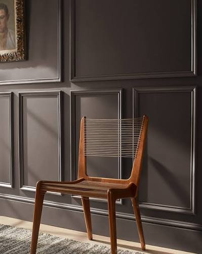
1. Espresso Charcoal: The New Dramatic NeutralBenjamin Moore · Silhouette AF-655 · Approximate screen reference: #55463FSilhouette, Benjamin Moore’s 2026 Colour of the Year, combines rich espresso brown with subtle charcoal undertones. The result is a sophisticated shade that sits somewhere between chocolate, burnt umber and dark grey.Rather than relying on black to create contrast, espresso charcoal introduces warmth into a darker interior. It can look particularly effective in a study, dining room, library or living room with substantial natural light.The colour also works beautifully alongside walnut furniture, cream upholstery, antique brass and textured fabrics. For a more architectural look, carry the colour from the walls onto selected woodwork or built-in shelving.Recommended finish: Choose a matte or low-sheen finish for walls to emphasise the depth of the colour and minimise distracting reflections. Use satin or semi-gloss on properly prepared doors, cabinetry and trim if you want a sharper contrast.Styling note: Pair it with warm ivory rather than brilliant white if you want the room to feel inviting rather than stark.Where to explore it: Benjamin Moore — Silhouette AF-655. The manufacturer describes the shade as a blend of espresso hues and charcoal. .2. Warm Eucalyptus: Green with a Softer SideValspar.
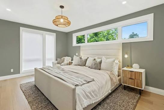
Warm Eucalyptus 8004-28F · Approximate screen reference: #777B55Green continues to be an important colour family in 2026, but the appeal extends beyond traditional sage. Warm eucalyptus has an earthy, muted quality that can bring colour into a room without demanding attention from every other element.Valspar selected Warm Eucalyptus as its 2026 Colour of the Year, describing it as a green with warm undertones inspired by nature. It sits comfortably alongside natural wood, woven textures, warm white walls and soft brown accents. .In a living room, it can create a restful backdrop for Christmas greenery and understated gold decorations. In a bedroom, it offers an alternative to the familiar pale neutrals used in many contemporary spaces.Recommended finish: A washable matte or durable low-sheen wall finish will give the colour a soft appearance. In kitchens and bathrooms, choose a product specifically designed for the moisture and cleaning requirements of the space.Styling note: Combine it with creamy white, natural oak and muted brass. For a bolder look, use a deeper green on cabinetry and a lighter neutral on surrounding walls.Where to explore it: Valspar. Confirm the availability of Warm Eucalyptus and its corresponding product range in your country before ordering.
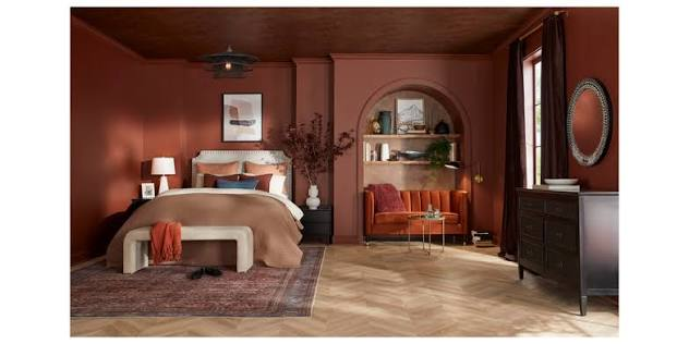
3. Warm Mahogany: A Rich Alternative to Christmas RedPPGWarm Mahogany PPG1060-7 · Approximate screen reference: #75433DChristmas red is familiar, but it is not the only way to bring warmth into an interior. Warm Mahogany, one of PPG’s 2026 Colour of the Year selections, offers a deeper, more restrained interpretation of red.It is a grounded shade that can work particularly well in dining rooms, intimate sitting areas and spaces intended for evening entertaining. Instead of making the room feel overtly seasonal, it introduces the depth associated with terracotta, wine and rich natural materials.PPG’s 2026 palettes also place this colour alongside earthy neutrals, mineral shades and richer greens, encouraging homeowners to layer colours rather than rely on one isolated statement wall. .Recommended finish: A matte or eggshell finish can suit living and dining-room walls. For woodwork, consider satin or semi-gloss if you want the architectural details to stand out.Styling note: Pair Warm Mahogany with warm ivory, walnut, dark green and aged brass. If you are concerned about a room feeling too dark, keep the ceiling light and introduce lighter upholstery.Where to explore it: PPG Paints — 2026 Colour Trends. Ask a participating retailer about PPG1060-7 and sample availability.
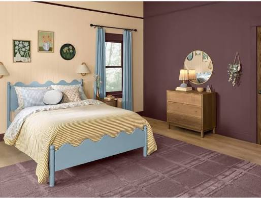
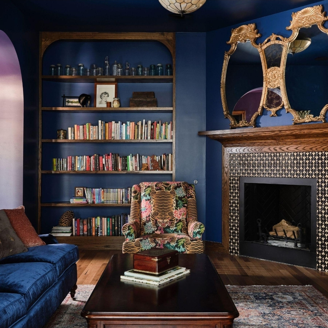
4. Purple Basil: The Case for a More Expressive InteriorPPG · Purple Basil PPG1046-7 · Approximate screen reference: #655064For homeowners who want something more individual, a deep purple can offer a compelling alternative to conventional navy, green or burgundy.Purple Basil appears in PPG’s 2026 colour and design palettes. Its deeper, botanical character makes it a candidate for rooms where atmosphere matters as much as brightness: a reading room, a bedroom, a dining area or a carefully chosen feature wall.The broader interest in aubergine and plum is also visible in Architectural Digest’s 2026 forecast, which highlights Little Greene’s Adventurer, a rich plum-aubergine shade selected as its Colour of the Year. .The appeal lies in its ability to create a distinctive interior without relying on bright, saturated colour. Used thoughtfully, purple can feel classic, contemporary or even slightly theatrical.Recommended finish: Use matte on walls for a soft, enveloping effect. A satin finish on cabinetry can introduce a little more definition, especially when paired with warm metallic hardware.Styling note: Combine it with muted rose, soft cream, dark wood or a restrained gold accent.
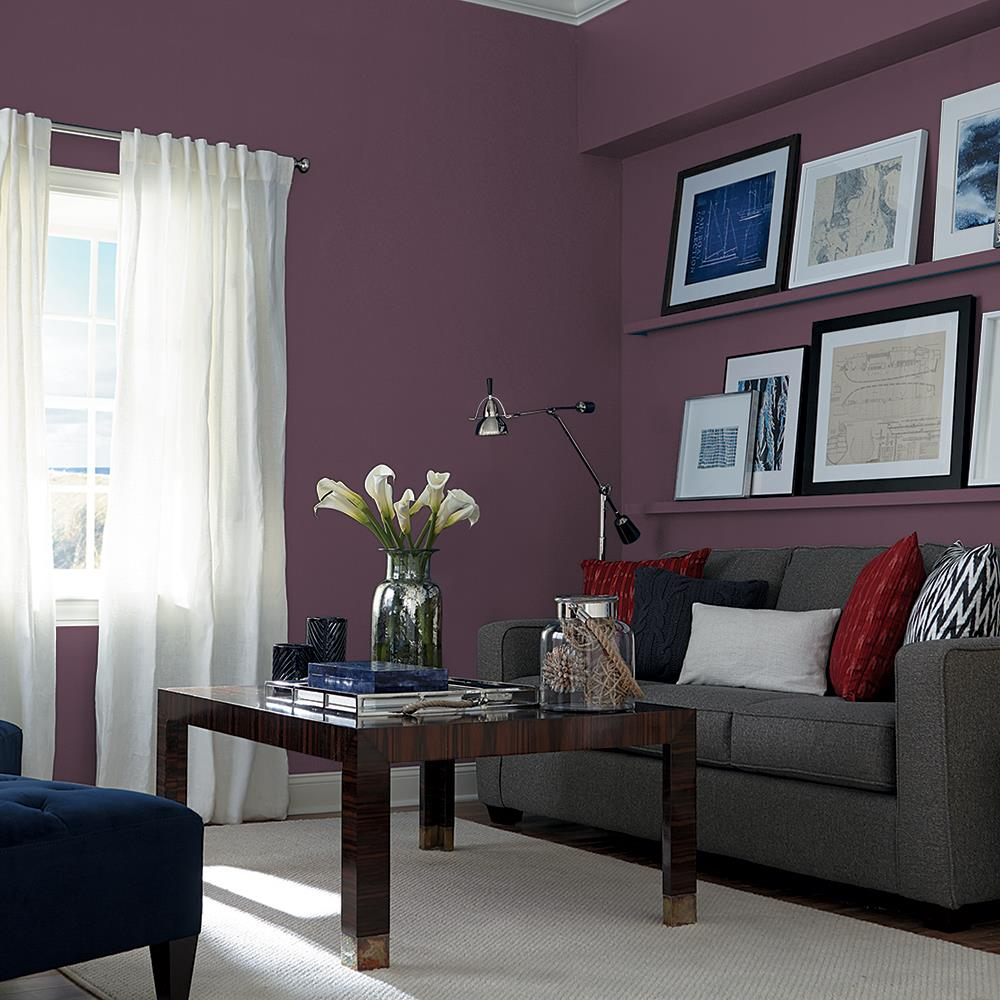
Test the colour carefully: deep purples can shift considerably under warm artificial lighting.Where to explore it: PPG Paints. Ask for Purple Basil PPG1046-7 and check that the shade is available in your local market.
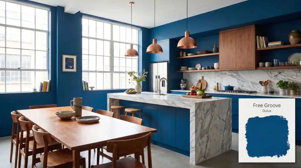
5. Free Groove: Indigo Blue with Architectural PresenceDulux UK · Free Groove 62BB 08/369 · Approximate screen reference: #343F59Blue has long been associated with calm interiors, but the indigo shades in Dulux UK’s 2026 palette have a deeper, more characterful quality.Free Groove is one of three indigo blues that form the backbone of Dulux’s 2026 colour collection, alongside Mellow Flow and Slow Swing. The palette allows homeowners to explore different intensities of blue, from atmospheric and dramatic to softer and more relaxed. .For Christmas, a deep blue wall can create a striking setting for white decorations, greenery, silver details and warm lighting. Beyond the festive season, it can work with pale stone, oak, cream upholstery and contemporary furniture.Recommended finish: Choose a matt finish for a velvety wall appearance. Consider satin for doors, cabinetry or selected woodwork, particularly if the intention is to create a more tailored, architectural scheme.Styling note: Indigo can absorb light, so use it strategically in rooms with limited daylight. If you want the colour to dominate without making the space feel enclosed, keep the ceiling and adjoining walls lighter.Where to explore it: Dulux UK — 2026 colour collection. The shade code is specific to Dulux’s colour system, so ask for a physical colour card or a suitable local match if buying elsewhere.
6. Melodious Ivory: Warmth Without the DramaDutch Boy Paints · Melodious Ivory 3132DB · Approximate screen reference: #E2D7BCNot everyone wants dark walls or a dramatic feature colour. Sometimes the best transformation comes from removing the visual chill of a room and replacing it with something softer.Melodious Ivory, Dutch Boy Paints’ 2026 Colour of the Year, offers a warm neutral that can work across traditional and contemporary interiors. The American Coatings Association includes it among the industry’s 2026 colour selections, describing its versatility as a backdrop for a range of decorative styles. .This is the shade for someone who wants to repaint an entire living room, brighten a hallway or create a neutral foundation for more colourful furniture and artwork. It also gives Christmas decorations room to breathe without making the home feel like a seasonal display.
Recommended finish: A flat or matte finish can work well on ceilings and walls with minor imperfections. For busy hallways, children’s rooms or areas that need regular cleaning, choose a durable washable matte or eggshell product designed for the surface.Styling note: Combine it with dark brown, eucalyptus green, terracotta or indigo. A warm neutral can connect several stronger colours across an open-plan home.Where to explore it: Dutch Boy Paints. Confirm local availability of the colour and product range before purchasing.Which Paint Finish Should You Choose?Colour determines the mood, but finish affects how the paint looks under light, how it feels visually and how well it stands up to everyday use.FinishBest suited toWhat to knowFlat or matteCeilings, formal living rooms, low-traffic bedroomsSoft appearance with little reflection; may be harder to clean unless formulated as washableEggshellLiving rooms, bedrooms, general interior wallsA subtle sheen with a practical balance between appearance and cleanabilitySatinHallways, children’s rooms, selected cabinetry and woodwork More reflective and generally easier to wipe; can reveal surface imperfectionsSemi-glossDoors, trim, cabinets and selected high-use surfacesMore sheen and easier cleaning; good preparation is essentialGlossStatement doors, detailed woodwork and selected cabinetryHighly reflective and dramatic, but highlights imperfections and requires careful preparationFinish names and performance vary between manufacturers, so always check the product’s intended use. A finish suitable for a bedroom wall may not be the right choice for a bathroom, kitchen cabinet or exterior surface.
A Few Things to Check Before PaintingTest the actual colour. The hex codes shown here are approximate digital references for editorial use. They are not paint formulas, and screens cannot reproduce a physical paint shade reliably. Use the manufacturer’s colour code and a physical sample.Look at the room at different times. Daylight, warm bulbs and cool LEDs can change how brown, green, blue and purple appear. Check your sample in the morning, afternoon and evening.Prepare the surface properly. Clean the walls, repair cracks, sand where necessary and use a suitable primer. Deep colours may require a tinted primer or additional coats, depending on the existing wall colour and paint product.Choose the finish for the room, not just the colour. A beautiful matte wall may be ideal for a quiet sitting room, while a busy hallway might need a more washable finish.Check availability locally. The US and European paint markets do not always carry identical ranges. Some colours can be matched by a local retailer, but a match should be tested before committing to an entire room.
The Final Word: Make the Home Feel Like Yours AgainThe six colours tell a broader story about interiors in 2026. Espresso charcoal and mahogany offer depth. Warm eucalyptus connects a room to nature. Purple Basil introduces personality. Indigo brings architectural drama, while Melodious Ivory keeps the home light and adaptable.The most interesting choice may not be the colour that appears most frequently in a forecast. It may be the one that changes how a room feels when you walk into it.Christmas offers a natural moment to reconsider the home, but the best makeover should last beyond the decorations. Whether the goal is a dramatic dining room, a calmer bedroom or a brighter living space, a considered colour and the right finish can make a meaningful difference without requiring an entirely new interior.A fresh coat of paint will not change the world outside. It can, however, change the atmosphere of the place where you return to it.