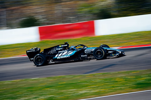
There’s an old adage in racing: if it looks fast standing still, it’ll be a blur at 200 mph. With the official 2026 reveal, the Cadillac Formula 1 Team didn’t just lean into that philosophy they electrified it.
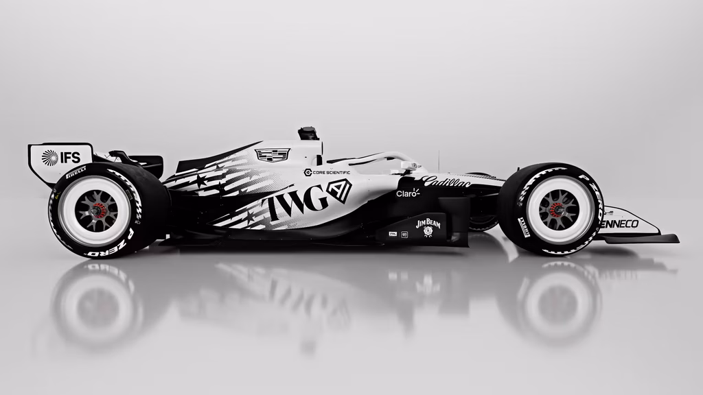
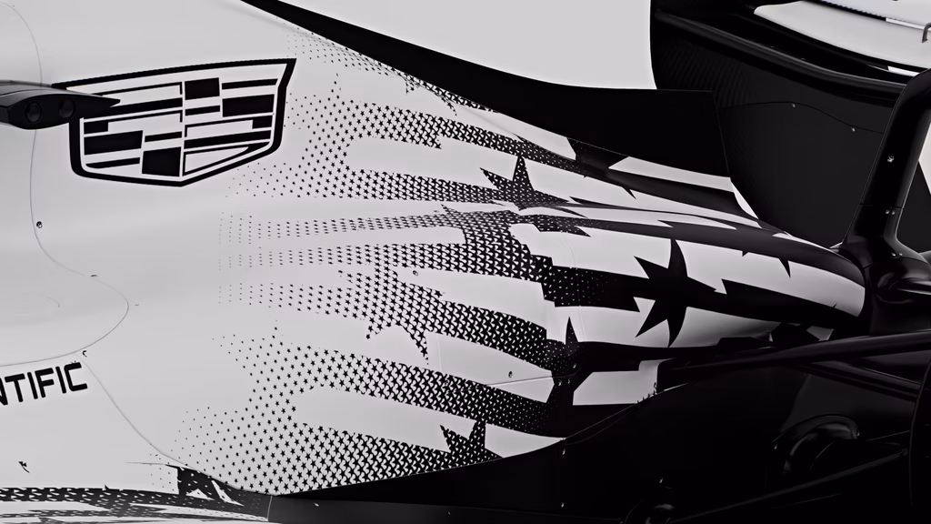
The centerpiece of the design those “stars and stripes” that morph into what looks like a jagged stroke of lightning is a masterstroke of visuals. It’s a nod to the American flag. Instead, the stripes are reimagined as high-voltage energy, cutting through the air like a literal storm front.
The Power of Asymmetry
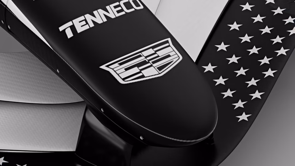
In a sport where symmetry is usually the rule of thumb, Cadillac went for the “Yin and Yang” approach. One side is a stark, optimistic white; the other, a mean, aggressive black.
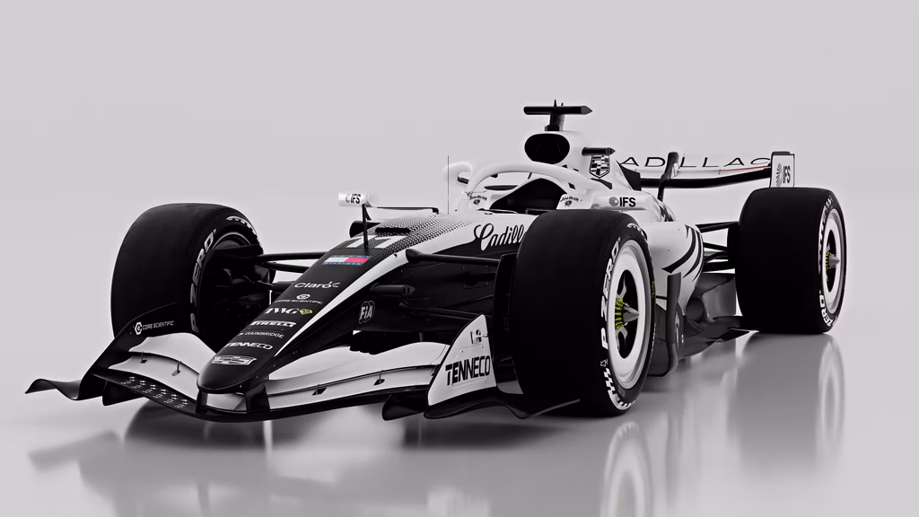
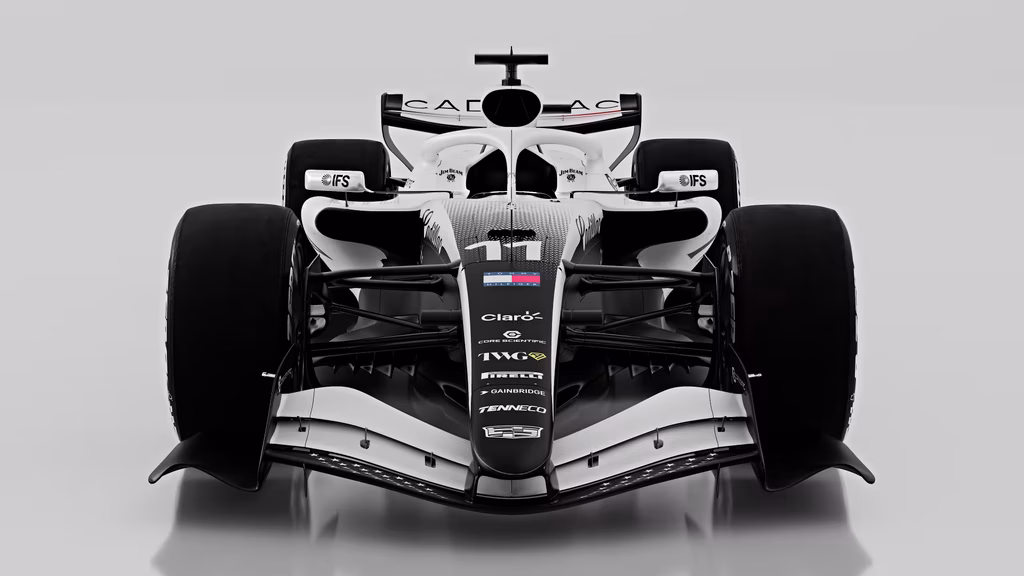
- The White Side: Represents the “Racing Color of America,” offering a clean, technical aesthetic that feels fresh and aspirational.
- The Black Side: Pure attitude. It’s grounded, gritty, and makes the car look like a heavyweight contender entering the ring.
But it’s the transition the “lightning stroke” stripes that bridges these two worlds. By using a repeating chevron pattern that gradients into a blur, the designers have managed to simulate forward momentum. It doesn’t just sit there; it looks like it’s mid-acceleration even while parked on a Super Bowl commercial stage.
Why “Looking the Fastest” Matters
All jokes about visual horsepower aside, the livery serves a functional purpose: Intimidation. F1 is as much a psychological game as a technical one. When you see that asymmetric flash in your mirrors one side dark, one side light, connected by a bolt of patriotic electricity it sends a message. It’s bold, it’s modern, and it’s unmistakably “New World.” Cadillac isn’t coming to the grid to be the 11th team; they’re coming to be the loudest.