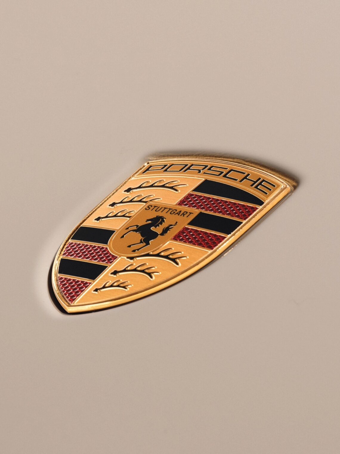
When you look at the hood of a Porsche 911, you aren’t just looking at a corporate trademark. You are looking at a highly condensed, gold-plated history lesson.
Concocted in 1952 by the brilliant Austrian engineer and draftsman Franz Xaver Reimspieß under the direction of Ferry Porsche, the Porsche crest is widely celebrated for its clean, athletic aesthetic. However, its true genius lies in its composition. Reimspieß divided the shield into distinct quadrants, weaving together centuries of geopolitical warfare, regional pride, and a medieval family legacy that stretches back over a thousand years.
The Core: Stuttgart’s Rearing Horse
At the absolute center of the crest sits a smaller yellow shield containing a rearing black horse, topped cleanly by the word Stuttgart. This central element is a direct nod to the city where Porsche established its roots—but the origin of that horse dates back to the year 950 AD, rooted in the foundational history of the Holy Roman Empire.

During the mid-10th century, Holy Roman Emperor Otto I (Otto the Great) was fighting off brutal, highly mobile nomadic invasions from the Magyars. Realizing the empire desperately needed an elite cavalry presence to defend its borders, Otto turned to his son, Liudolf, Duke of Swabia.
Otto tasked his son with establishing a dedicated, high-tier horsebreeding farm in a fertile, basin-like valley in southern Germany. Liudolf founded this military breeding ground, naming it Stutengarten—literally translating from Old High German to English as “Stud Garden” or “Mare Garden.” Over the centuries, the phonetic pronunciation shifted, the military outpost grew into a bustling industrial metropolis, and the name compacted into Stuttgart.

When Reimspieß placed the rearing black horse at the center of the badge, he was directly channeling Duke Liudolf’s ancient, high-performance equestrian legacy into the machinery of modern sports cars.
The Quadrants: The Shield of Württemberg
Surrounding Otto and Liudolf’s black horse are four distinct quadrants that form the outer coat of arms. These quadrants are lifted directly from the traditional crest of the free state of Württemberg-Hohenzollern, the historic German region encompassing Stuttgart.
[ Top Left: 3 Antlers ] [ Top Right: Red/Black Stripes ]
[ — ] [ — ]
[ Bottom Left: Stripes ] [ Bottom Right: 3 Antlers ]
The Top-Left & Bottom-Right Quadrants: The Stylized Antlers
These sectors feature three black, stylized stag antlers set against a golden background. This iconography belongs to the ancient House of Württemberg, dating back to at least the 13th century. It pays homage to the region’s historic hunting traditions, deep pine forests, and the raw, natural power of the native Swabian wilderness.
The Top-Right & Bottom-Left Quadrants: The Red and Black Stripes
Alternating thick bands of deep red and black fill the remaining corners. In traditional European heraldry, these bands represented the official state colors of the old dukedom. Red symbolized courage, sacrifice, and the blood spilled defending the realm, while black stood for determination, strength, and the fertile soil of the Swabian landscape.
The Roof: A Protector’s Header
Binding this dense tapestry of regional history together is the clean, powerful, arched PORSCHE lettering. Sitting like a protective header over the entire shield, it acts as a modern architectural bridge. By placing the family name directly above the crest, Reimspieß firmly tied the destiny of the Porsche family to the rich, medieval heritage of the land that nurtured them.
Crest Iconography At-A-Glance
|
Emblem Component |
Historical Origin |
Symbolism & Meaning |
|---|---|---|
|
Rearing Black Horse |
Duke Liudolf & Emperor Otto I (950 AD) |
Founded as Stutengarten (Stud Garden); represents raw horsepower and heritage. |
|
Black Stag Antlers |
House of Württemberg (13th Century) |
Connection to the Swabian wilderness, natural power, and tradition. |
|
Red & Black Stripes |
Historic State Colors of the Dukedom |
Red: Bravery and sacrifice. Black: Strength, resolve, and regional soil. |
|
PORSCHE Header |
1952 Porsche Bureau Design |
Seals the family name to the ancient lineage of the region. |
A “Pinkies Down” Aesthetic Masterpiece: The ultimate brilliance of the Porsche logo is that it manages to be deeply traditional without ever feeling dusty or pretentious. It strips away the over-complicated fluff of old-money European coats of arms, flattening the geometry just enough to look equally at home on a medieval battlefield or shimmering on a carbon-fiber hood at 180 mph.